Exploring Jetpack Compose Animations
Introduction
I've been wanting to get some hands on experience with how animations work in Jetpack compose and compare how easy/difficult it would be take an idea and then build it using compose. For the record, I've built UI's for android before many a times, however, animation is something that I've never enjoyed building or debugging. For some reason animations in android have always felt clunky to me and the api's associated with animations have always been a pain to work with (for the most part). However, in the spirit of learning new things, I challenged myself to build something that was animated. It didn't matter what it was as long as it touched the animation framework provided by compose. The question was what to build?
I've been wanting to add the ability for the user to be able to search for games directly from the main home screen, however, I couldn't find the right way to introduce it. I felt that showing a search bar that is always visible would be just too boring and then it struck me that I could potentially try to animate the search bar into the main home screen. The small eye candy an animating search bar would bring to the user experience would be a perfect way to add search to the main screen. So that is what I did 😃
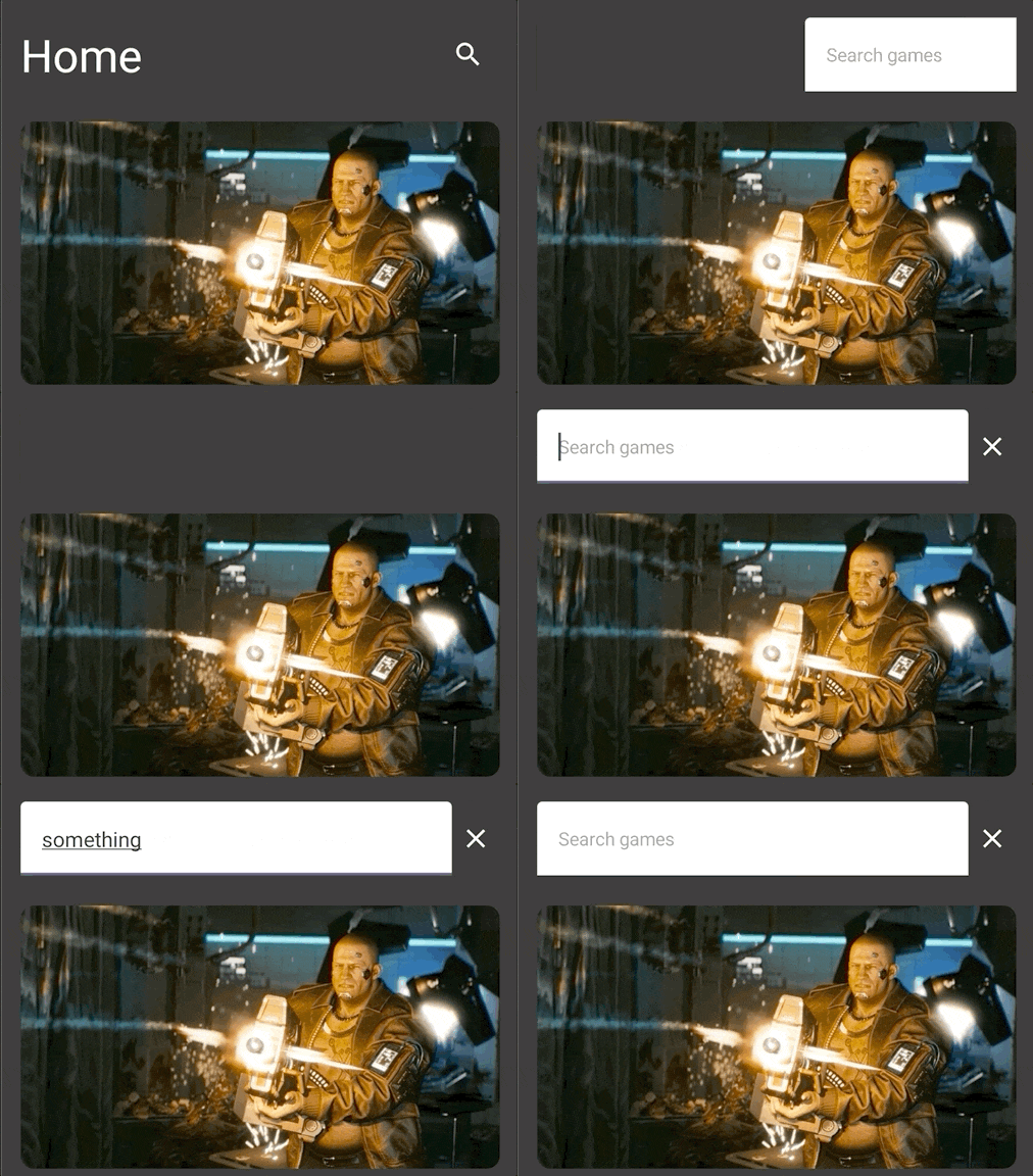
Let me show you what I have built till now and then we can talk about how I went about doing it.
Structure
If you pay close attention to what is happening above, you can see that at any given time the UI can be in one of two given states. For the sake of being able to easily explain I will call these states:
- Title State (Default State) - The state that shows you the title and the search icon.
- Search State - The state that shows your the "x" icon and the search field
If you can wrap your head around the fact that the UI is composed of the above two states, then the first step in this entire process is to describe how to build the two states.
We can start with the Title state. It can look something like this:
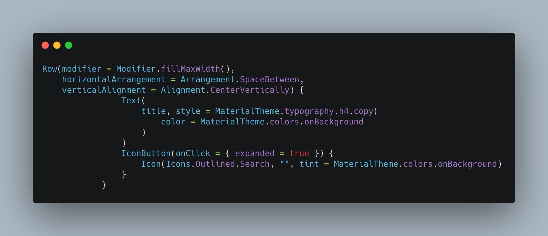
It's a fairly simple Row that contains a Text and Icon and the horizontal spacing is set to SpaceBetween to push the two elements to either ends.
Next let's tackle the Search State. It can look something like this:
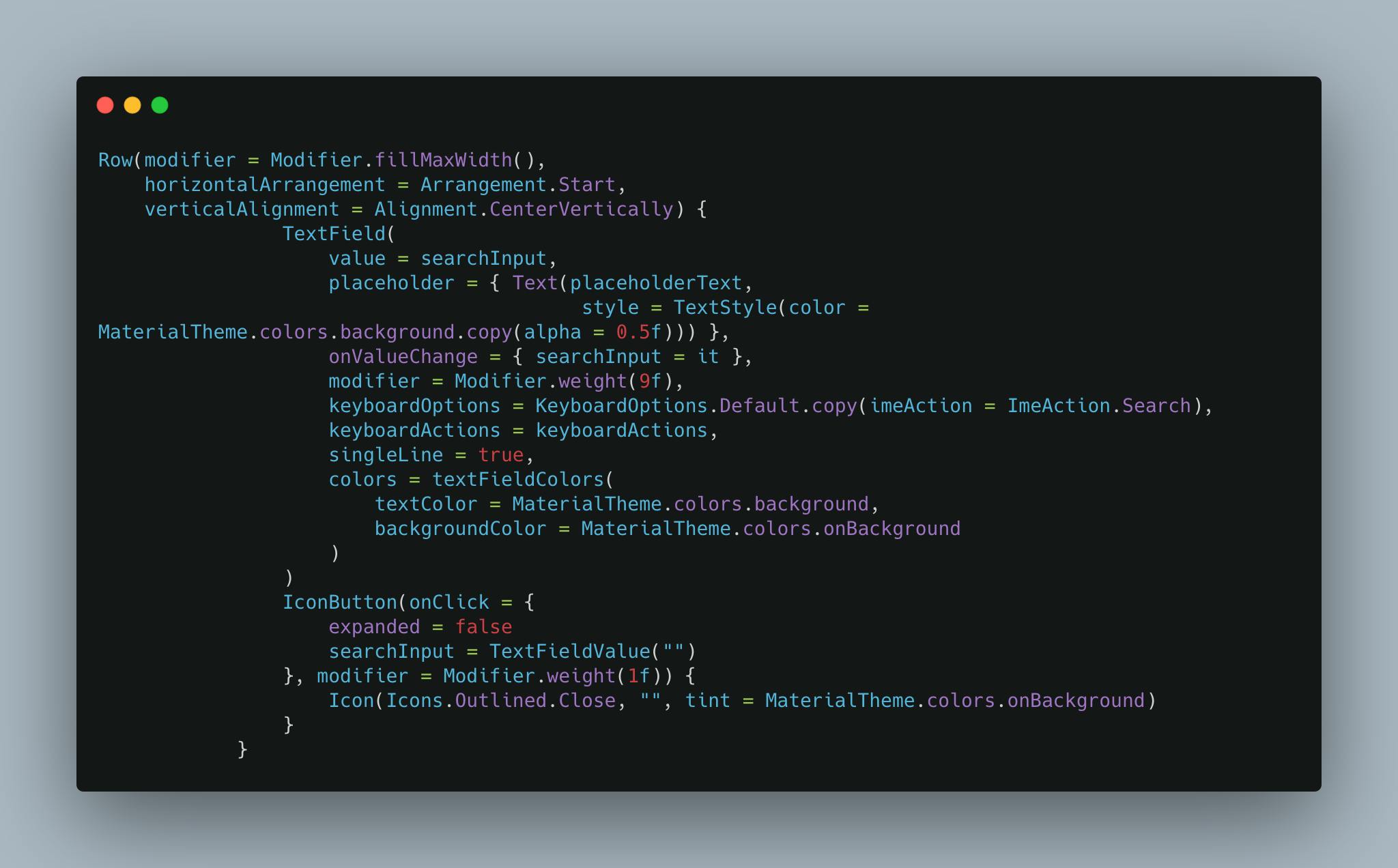
Again fairly straightforward but the one thing to note is the weight modifier. In order to allow the input to take the most part of the screen I've set the ratio to 9:1 in favor of the input. This is an easy way to get the kind of layouts you would like to achieve without having to fiddle with the width modifier.
With these two states out of the way, next steps is to find a way to switch between them. This can be easily done by using something like state variable inside of the composable that controls which state is rendered and then manipulating the state variable. One could potentially achieve that by doing something like
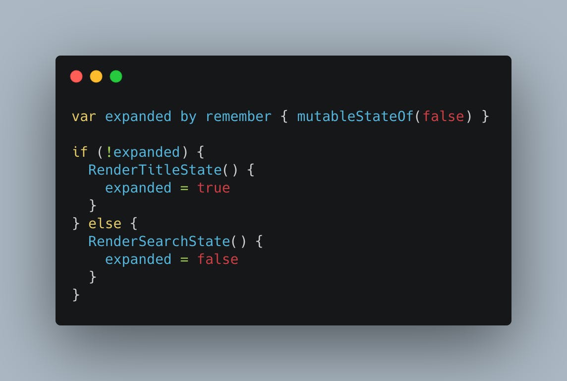
At this point congratulations you've done your first bit of animation in compose. Noted that the animation isn't smooth and it's mostly a transition however, you've done something. Believe it or not from here to what I showed you before is the matter of introducing on more composable to the table. Meet AnimatedVisibility
AnimatedVisibility as the name so aptly puts it, animates the visibility of it's contents based on a parameter that is provided to it. In other words, you tell it when to show/hide the content inside of it and it does the heavy lifting of animating between the two states for you. What's great about animated visibility is that it allows your to customize the enter and exit animations of the content so you can do fairly basic slideIn's, slideOut's without too much code.
For my particular use case I was trying to animate in the search bar from the side of the search icon and then exit it back the way it came in. While that was happening I just wanted the title and the search icon to disappear and then re-appear. So putting everything I've talked about together, we get the following composable
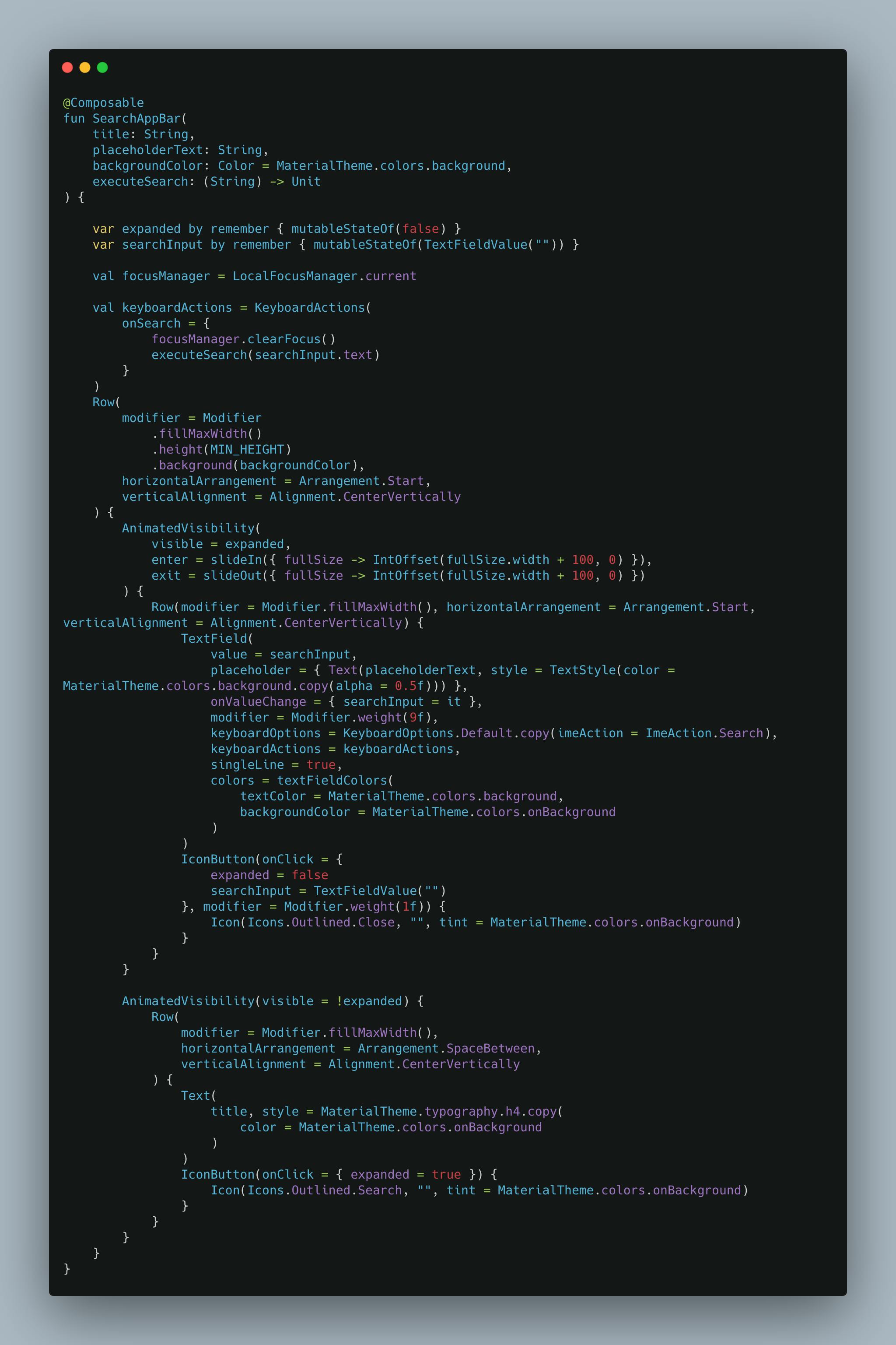
A couple of things to note here:
AnimatedVisibilityby default will use fadeIn and fadeOut combined with expand and shrink. This is perfect for what I want for the title state hence, I don't customize the enter and exit animations for them.- Pay close attention to how we calculate the offset of the search state. Both enter and exit animations need a lambda that provides them with an offset that defines where the animation is going to begin/end. For our particular use case I wanted the search bar to float in from right and then float back out to the right. Hence for both my enter and exit animations I've provided the offset in the x direction to be the
fullWidth + 100. You can make this value whatever you would like and also combine it by providing a offset in y direction (which would then make the search bar animate in the y direction as well).
Conclusion
As you can see, building an animation in compose is fairly straightforward once you can wrap your head around the different states your app could be in. From there most of the heavy lifting is done by the framework itself and you just have to figure out how to fix the pieces together. I've found myself enjoying this deep dive into animations in compose and I will try to incorporate more of these into the app in the future. You can find the whole source code for the composable here
