

Declarative UI in Android
Thinking of android's UI in terms of composability.


Introduction
I've been involved in building android apps for the last 7 years and in those years, the way we've approached building user interfaces in Android hasn't changed much. The framework itself has most definitely improved a lot over the years, with things like RecyclerView and ConstraintLayout changing how most developer built user interfaces. However, in essence anytime we've had to build a user interface in android, we've had to follow the following steps:
- Create a layout file in XML that describes what that view looks like.
- Use said layout file in our code to attach the view to the
activity/fragment/viewthat we are inflating. - Manipulate the view using the code and/or listen for user interactions.
This method of building user interfaces has served us very well for a while now and continues to do so for many developers out there.
In the meanwhile, other mobile frameworks have popped up such as React Native and Flutter and they've brought with them their interpretations of how user interfaces should be built. Whenever I've dabbled with these frameworks in the past, I've always admired how fluent it was to build user interfaces in them. For example, in flutter in order to add some padding to a view(widget as flutter calls them), you just wrap the view inside of a padding view(widget). Quite intuitive right? Similarly if you want something to be below something else, there is Column widget you can use to put something below the other.
This declarative way of building user interfaces is highly flexible and forces us as developers to break our complex user interface into smaller chunks. Also by building our interfaces like this we are encouraged to re-use our code. Let me demonstrate both of these using the example of Scout
UI elements as composables
Lets look at two different user interface components in Scout.
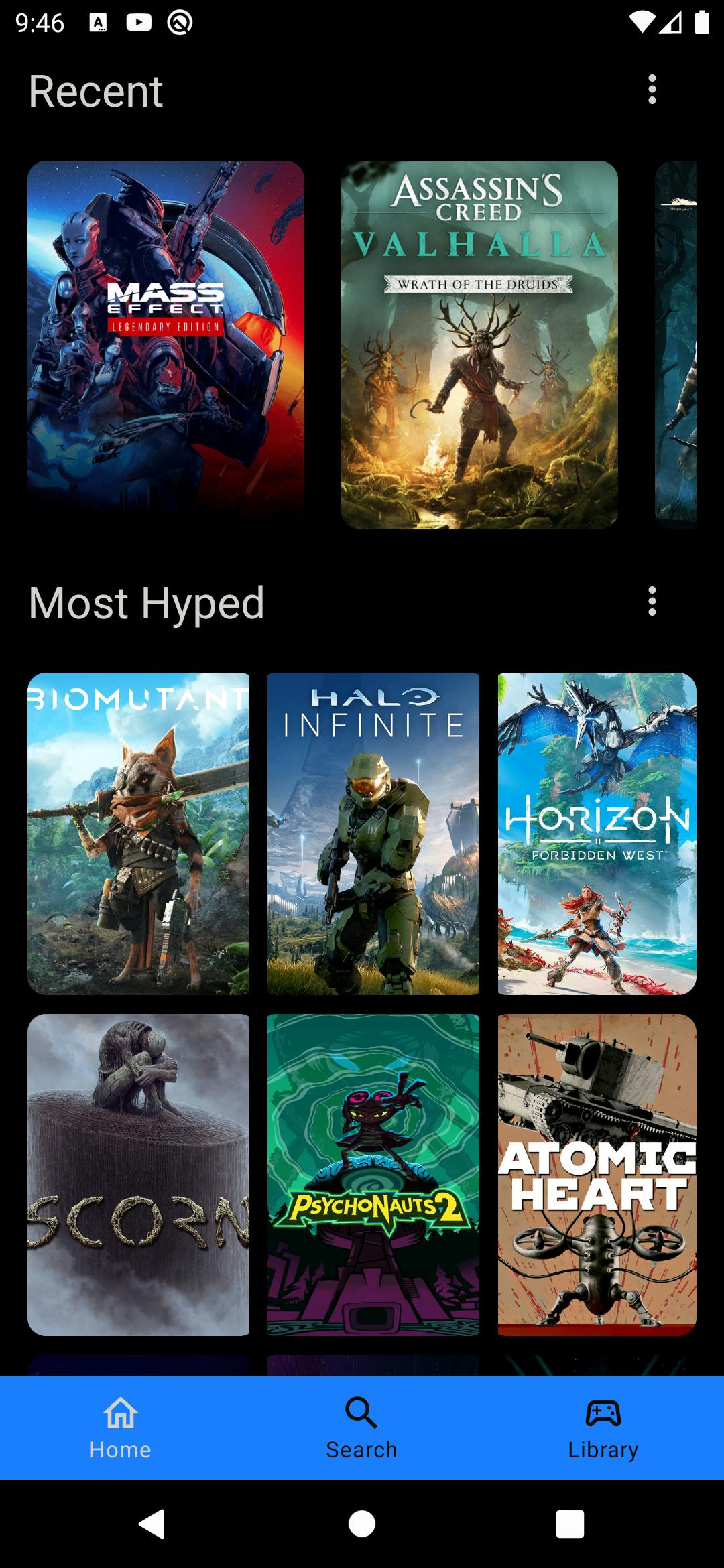
As you can see, you are looking at two different lists that show you game posters. The one on the top allows the list to be scrolled horizontally and the one below is a 9x9 grid of posters. But do you notice something similar about the two user interface elements.


Both of the lists are topped by a title bar that contains the name of the list to the left and a icon to the right that allows the users to expand the list. Since both the headers for the lists are identical in an ideal world, you could write this component once and then be able to re-use it again and again. While this is possible to do with our XML based framework today, what I want to illustrate here is how much easier and better it gets with the compose.
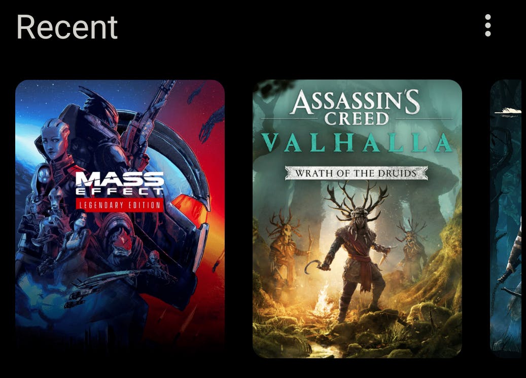
Let's focus our attention to the image above, how can we break that UI element into smaller chunks. One thing we can notice off the bat, is that the layout can be described as follows:
- A horizontal layout containing the title and the icon button
- Below that some spacing
- Below that a list of Images
Taking the above description of our we can convert into what I call the TitleContainer in my app and it looks something like this:
@Composable
fun TitleContainer(
    title: String,
    titleColor: Color = MaterialTheme.colors.onBackground,
    hasViewMore: Boolean = true,
    onViewMoreClicked: (() -> Unit)? = null,
    content: @Composable () -> Unit
) {
    Column {
        TitleRow(
            title = title,
            titleColor = titleColor,
            onViewMoreClicked = onViewMoreClicked,
            hasViewMore = hasViewMore
        )
        Spacer(modifier = Modifier.height(15.dp))
        content()
    }
}
Let's break that down:
- The
Columnis a composable that can layout it's children one below the other. - The
TitleRowis a custom composable I wrote but for now lets assume it represents the title and the icon button. Spacerallows us to add some space between the title and thecontent- Followed by the
content, where content can be any other composable.
Now let's focus our attention to the TitleRow.

As you can see it's a horizontal layout of sorts, that houses our title to the left and the icon button to the right. This can be represented as below. Note the use of a Row composable which knows how to horizontally layout it's children one after the other. Also the use of the horizontalArrangement param to the Row composable allows us put a spacer between the title and the icon button.
@Composable
fun TitleRow(
    title: String,
    titleColor: Color,
    onViewMoreClicked: (() -> Unit)?,
    hasViewMore: Boolean
) {
    Row(
        horizontalArrangement = Arrangement.SpaceBetween,
        verticalAlignment = Alignment.CenterVertically,
        modifier = Modifier
            .fillMaxWidth()
    ) {
        Text(
            title,
            style = MaterialTheme.typography.h5.copy(color = titleColor)
        )
        if (hasViewMore && onViewMoreClicked != null) {
            IconButton(onClick = onViewMoreClicked) {
                Icon(Icons.Outlined.MoreVert, "More", tint = MaterialTheme.colors.onBackground)
            }
        }
    }
}
What I like about it
Because we built out
TitleContainerto accept acontentparam that can represent any composable, we can now easily create the 9x9 grid I had shown before. By replacing the content param with a image grid we can easily create another functional user interface element without too much work. That's exactly what I do hereI also find this way of think of user interface elements are composables and that your final user interface is a bunch of composables working together to form something cohesive, more natural than the old way of building user interfaces in Android. Granted that this way of building UI does have it's challenges, especially when it comes to build reactive UI that changes based on state, but in general, I've found myself enjoying compose a lot more than XML based layouts.
Testing user interface elements is more easier with compose (sort of). There are some tooling challenges with writing tests for compose (I've run into several issues around emulators failing to load,etc), however, the fact that a composable function for the most part are pure functions it lends itself very well to be testing. I will be conducting more investigation into this when I add more tests to the project.
Conclusion
I've very much enjoyed my time with Jetpack Compose and it's approach towards building interfaces. I've learnt a lot about how to think in terms of user interface composability and how different parts can be put together to form a cohesive unit. All of this has been a great learning experience for sure.